
Table of Contents
Setting up the project
					npm create vite@4.1.0

✔ Project name: … game-hub
✔ Select a framework: › React
✔ Select a variant: › TypeScript

Scaffolding project in /Users/shazdeh/Downloads/React-js/game-hub...

Done. Now run:

  cd game-hub
  npm install
  npm run dev

cd game-hub
npm i

added 77 packages, and audited 78 packages in 7s

7 packages are looking for funding
  run `npm fund` for details

found 0 vulnerabilities

npm run dev
					git init
git add .
git commit -m "Initial commit"
Installing Charka UI
- Go to the Chakra UI website,
- Click on the Get Started button.
- Select Vite on the bottom of the page from the Framework Guide section.
- Follow the instructions on the page.
npm i @chakra-ui/react @emotion/react @emotion/styled framer-motion
main.tsx
					import React from "react";
import ReactDOM from "react-dom/client";
import { ChakraProvider } from "@chakra-ui/react";
import App from "./App";
import "./index.css";

ReactDOM.createRoot(document.getElementById("root") as HTMLElement).render(
  <React.StrictMode>
    <ChakraProvider>
      <App />
    </ChakraProvider>
  </React.StrictMode>
);
App.tsx
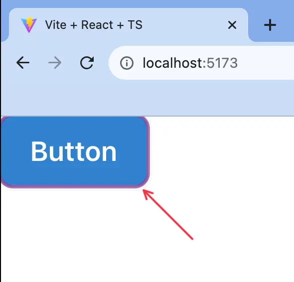
					import { Button, ButtonGroup } from "@chakra-ui/react";

function App() {
  return <Button colorScheme="blue">Button</Button>;
}

export default App;
To remove the ugly border around the button, clear the index.css default contents for Vite
To check the commits use the following command.
git log --oneline
Creating a responsive layout
Using the Grid System of Chakra UI to set the layout of the page
					import { Grid, GridItem } from "@chakra-ui/react";

function App() {
  return (
    <Grid templateAreas={`'nav nav' 'aside main'`}> {/* to add more than one string we use back ticks */}
      <GridItem area={"nav"} bg={"coral"}>
        Nav
      </GridItem>
      <GridItem area={"aside"} bg={"orange"}>
        Aside
      </GridItem>
      <GridItem area={"main"} bg={"blue"}>
        Main
      </GridItem>
    </Grid>
  );
}

export default App;
To make the layout responsive do the following changes in the code:
					import { Grid, GridItem, Show } from "@chakra-ui/react";

function App() {
  return (
    <Grid
      templateAreas={{
        base: `'nav' 'main'`,
        lg: `'nav nav' 'aside main'`,
      }}
    >
      <GridItem area={"nav"} bg={"coral"}>
        Nav
      </GridItem>
      <Show above="lg">
        <GridItem area={"aside"} bg={"orange"}>
          Aside
        </GridItem>
      </Show>
      <GridItem area={"main"} bg={"blue"}>
        Main
      </GridItem>
    </Grid>
  );
}

export default App;
Building the navigation bar
App.tsx
					import { Grid, GridItem, Show } from "@chakra-ui/react";
import NavBar from "./components/NavBar";

function App() {
  return (
    <Grid
      templateAreas={{
        base: `'nav' 'main'`,
        lg: `'nav nav' 'aside main'`,
      }}
    >
      <GridItem area={"nav"}>
        <NavBar />
      </GridItem>
      <Show above="lg">
        <GridItem area={"aside"} bg={"orange"}>
          Aside
        </GridItem>
      </Show>
      <GridItem area={"main"} bg={"blue"}>
        Main
      </GridItem>
    </Grid>
  );
}

export default App;
src/components/NavBar.tsx
					import { HStack, Image, Text } from "@chakra-ui/react";
import logo from "../assets/logo.webp";

const NavBar = () => {
  return (
    <HStack>
      <Image src={logo} boxSize={"60px"} />
      <Text>NavBar</Text>
    </HStack>
  );
};

export default NavBar;
Implementing the dark mode
Follow the Chakra color mode instruction from the following link:
src/theme.ts
					import { extendTheme, ThemeConfig } from "@chakra-ui/react";

const config: ThemeConfig = {
  initialColorMode: 'dark'
}

const theme = extendTheme({ config });

export default theme;
main.tsx
					import React from "react";
import ReactDOM from "react-dom/client";
import { ChakraProvider, ColorModeScript } from "@chakra-ui/react";
import App from "./App";
import theme from "./theme";
import "./index.css";

ReactDOM.createRoot(document.getElementById("root") as HTMLElement).render(
  <React.StrictMode>
    <ChakraProvider theme={theme}>
      <ColorModeScript initialColorMode={theme.config.initialColorMode} />
      <App />
    </ChakraProvider>
  </React.StrictMode>
);
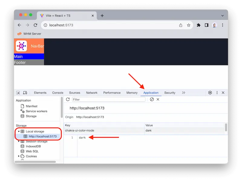
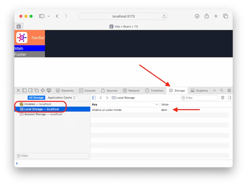
After implementing the dark mode, you might not see the changes. For that, check the local storage of your browser and see the value of chakra-ui-color-mode and delete it, then refresh the page.
You can find it in your developer mode of your browser that are different in each browser:
Building the color mode switch
components/ColorModeSwitch.tsx
					import { HStack, Switch, Text, useColorMode } from "@chakra-ui/react";

const ColorModeSwitch = () => {
  const { toggleColorMode, colorMode } = useColorMode();

  return (
    <HStack>
      <Switch
        colorScheme={"green"}
        isChecked={colorMode === "dark"}
        onChange={toggleColorMode}
      />
      <Text>Dark mode</Text>
    </HStack>
  );
};

export default ColorModeSwitch;
components/NavBar.tsx
					import { HStack, Image } from "@chakra-ui/react";
import logo from "../assets/logo.webp";
import ColorModeSwitch from "./ColorModeSwitch";

const NavBar = () => {
  return (
    <HStack justifyContent={"space-between"} padding={"10px"}>
      <Image src={logo} boxSize={"60px"} />
      <ColorModeSwitch></ColorModeSwitch>
    </HStack>
  );
};

export default NavBar;
Fetching the Games
Go to RAWG website and get your API key after signing up. And copy the provided API key.
Install Axios (Axios is a promise-based HTTP Client for node.js and the browser.)
npm i axios
services/api-client.ts
					import axios from "axios";

// Create an Axios instance with a custom configuration
export default axios.create({
  baseURL: 'https://api.rawg.io/api',
  params: {
    // The key will be included in the query string of every HTTP request we send to our backend.
    key: '4a0759f4sdjghaa1bd7skdhgb8893a1f'
  }
})
Copy the url of the baseURL form the following link:
component/GameGrid.tsx
					import React, { useEffect, useState } from "react";
import apiClient from "../services/api-client";
import { Text } from "@chakra-ui/react";

interface Game {
  id: number;
  name: string;
}

interface FetchGamesResponse {
  count: number;
  results: Game[];
}

const GameGrid = () => {
  // State a variable for storing our game objects.
  const [games, setGames] = useState<Game[]>([]);
  // State a variable for error messages.
  const [error, setError] = useState("");
  // Effect hook to send a fetch request to the backend
  useEffect(() => {
    apiClient
      .get<FetchGamesResponse>("/gamess")
      .then((res) => setGames(res.data.results))
      .catch((err) => setError(err.message));
  });
  return (
    <>
      {error && <Text>{error}</Text>}
      <ul>
        {games.map((game) => (
          <li key={game.id}>{game.name}</li>
        ))}
      </ul>
    </>
  );
};

export default GameGrid;
App.tsx
					import { Button, ButtonGroup, Show } from "@chakra-ui/react";
import { Grid, GridItem } from "@chakra-ui/react";
import NavBar from "./components/NavBar";
import GameGrid from "./components/GameGrid";

function App() {
  return (
    <Grid
      templateAreas={{
        base: `'nav' 'main'`,
        lg: `'nav nav' 'aside main'`,
      }}
      gap={3}
    >
      <GridItem area={"nav"} bg="blue.500">
        <NavBar />
      </GridItem>
      <Show above="lg">
        <GridItem area={"aside"} bg="blue.500">
          ASIDE
        </GridItem>
      </Show>
      <GridItem area={"main"} bg="blue.500">
        <GameGrid />
      </GridItem>
    </Grid>
  );
}

export default App;
Custom Hook for Fetching Games
Components are responsible for returning markup and handling user interactions at a high level.
Here we have two options.
- One way is to move the logic for making HTTP requests inside a service as we did in the previous section.
- The other option is to move the entire logic meaning the state variables and the effect inside a hook.
So hooks are not necessarily for sharing functionality across different components, We can also use them to separate concerns and making our codes more modular and reusable.
src/hooks/useGames.ts
					import { useEffect, useState } from "react";
import apiClient from "../services/api-client";
import { CanceledError } from "axios";

interface Game {
  id: number;
  name: string;
}

interface FetchGamesResponse {
  count: number;
  results: Game[];
}

const useGames = () => {
  const [games, setGames] = useState<Game[]>([]);
  const [error, setError] = useState("");
  useEffect(() => {
    const controller = new AbortController();

    apiClient
      .get<FetchGamesResponse>("/games", { signal: controller.signal })
      .then((res) => setGames(res.data.results))
      .catch((err) => {
        if (err instanceof CanceledError) return;
        setError(err.message);
      });

    return () => controller.abort();
  }, []);

  return { games, error };
};

export default useGames;
component/GameGrid.tsx
					import { Text } from "@chakra-ui/react";
import useGames from "../hooks/useGames";

const GameGrid = () => {
  const { games, error } = useGames();

  return (
    <>
      {error && <Text>{error}</Text>}
      <ul>
        {games.map((game) => (
          <li key={game.id}>{game.name}</li>
        ))}
      </ul>
    </>
  );
};

export default GameGrid;
Building Game Cards
component/GameCard.tsx
					import React from "react";
import { Game } from "../hooks/useGames";
import { Card, CardBody, Heading, Image } from "@chakra-ui/react";

interface Props {
  game: Game;
}

const GameCard = ({ game }: Props) => {
  return (
    <Card borderRadius={10} overflow="hidden">
      <Image src={game.background_image} />
      <CardBody>
        <Heading fontSize="2xl">{game.name}</Heading>
      </CardBody>
    </Card>
  );
};

export default GameCard;
src/hooks/useGames.ts
					import { useEffect, useState } from "react";
import apiClient from "../services/api-client";
import { CanceledError } from "axios";

export interface Game {
  id: number;
  name: string;
  background_image: string;
}

interface FetchGamesResponse {
  count: number;
  results: Game[];
}

const useGames = () => {
  const [games, setGames] = useState<Game[]>([]);
  const [error, setError] = useState("");
  useEffect(() => {
    const controller = new AbortController();

    apiClient
      .get<FetchGamesResponse>("/games", { signal: controller.signal })
      .then((res) => setGames(res.data.results))
      .catch((err) => {
        if (err instanceof CanceledError) return;
        setError(err.message);
      });

    return () => controller.abort();
    // An array of dependencies and the effect hook. Without this, we constantly send a request to our backend.
  }, []);

  return { games, error };
};

export default useGames;
component/GameGrid.tsx
					import { SimpleGrid, Text } from "@chakra-ui/react";
import useGames from "../hooks/useGames";
import GameCard from "./GameCard";

const GameGrid = () => {
  const { games, error } = useGames();

  return (
    <>
      {error && <Text>{error}</Text>}
      <SimpleGrid
        columns={{ sm: 1, md: 2, lg: 3, xl: 5 }}
        padding={"10px"}
        spacing={10}
      >
        {games.map((game) => (
          <GameCard key={game.id} game={game} />
        ))}
      </SimpleGrid>
    </>
  );
};

export default GameGrid;
Displaying platform icons
npm i react-icons@4.7.1
component/PlatformIconList.tsx
					import {
  FaWindows,
  FaPlaystation,
  FaXbox,
  FaApple,
  FaLinux,
  FaAndroid,
} from "react-icons/fa";
import { MdPhoneIphone } from "react-icons/md";
import { SiNintendo } from "react-icons/si";
import { BsGlobe } from "react-icons/bs";
import { HStack, Icon, Text } from "@chakra-ui/react";
import { Platform } from "../hooks/useGames";
import { IconType } from "react-icons";

interface Props {
  platforms: Platform[];
}

const PlatformIconList = ({ platforms }: Props) => {
  // Add index signature: [key: string]
  const iconMap: { [key: string]: IconType } = {
    pc: FaWindows,
    playstation: FaPlaystation,
    xbox: FaXbox,
    nintendo: SiNintendo,
    mac: FaApple,
    linux: FaLinux,
    android: FaAndroid,
    ios: MdPhoneIphone,
    web: BsGlobe,
  };
  return (
    <HStack marginY={1}>
      {platforms.map((platform) => (
        <Icon as={iconMap[platform.slug]} color={"gray.500"} />
        // <Text color={"gray.500"}>{platform.name}</Text>
      ))}
    </HStack>
  );
};

export default PlatformIconList;
component/GameCard.tsx
					import React from "react";
import { Game, Platform } from "../hooks/useGames";
import { Card, CardBody, Heading, Image, Text } from "@chakra-ui/react";
import PlatformIconList from "./PlatformIconList";

interface Props {
  game: Game;
}

const GameCard = ({ game }: Props) => {
  return (
    <Card borderRadius={10} overflow="hidden">
      <Image src={game.background_image} />
      <CardBody>
        <Heading fontSize="2xl">{game.name}</Heading>
        {/* Solution 01 */}
        {/* {game.parent_platforms.map((platform) => (
          <Text>{platform.platform.name}</Text>
        ))} */}
        {/* Solution 02 */}
        {/* {game.parent_platforms.map(({ platform }) => (
          <Text color={"gray.500"}>{platform.name}</Text>
        ))} */}
        <PlatformIconList
          platforms={game.parent_platforms.map((p) => p.platform)}
        />
      </CardBody>
    </Card>
  );
};

export default GameCard;
src/hooks/useGames.ts
					import { useEffect, useState } from "react";
import apiClient from "../services/api-client";
import { CanceledError } from "axios";

export interface Platform {
  id: number;
  name: string;
  slug: string;
}

export interface Game {
  id: number;
  name: string;
  background_image: string;
  parent_platforms: { platform: Platform }[];
}

interface FetchGamesResponse {
  count: number;
  results: Game[];
}

const useGames = () => {
  const [games, setGames] = useState<Game[]>([]);
  const [error, setError] = useState("");
  useEffect(() => {
    const controller = new AbortController();

    apiClient
      .get<FetchGamesResponse>("/games", { signal: controller.signal })
      .then((res) => setGames(res.data.results))
      .catch((err) => {
        if (err instanceof CanceledError) return;
        setError(err.message);
      });

    return () => controller.abort();
    // An array of dependencies and the effect hook. Without this, we constantly send a request to our backend.
  }, []);

  return { games, error };
};

export default useGames;
Displaying Critic Score
component/CriticScore.tsx
					import { Badge } from "@chakra-ui/react";

interface Props {
  score: number;
}

const CriticScore = ({ score }: Props) => {
  let color = score > 90 ? "green" : score > 80 ? "orange" : "";
  return (
    <Badge fontSize={"14px"} colorScheme={color} paddingX={2} borderRadius={2}>
      {score}
    </Badge>
  );
};

export default CriticScore;
component/GameCard.tsx
					import { Game, Platform } from "../hooks/useGames";
import { Card, CardBody, HStack, Heading, Image, Text } from "@chakra-ui/react";
import PlatformIconList from "./PlatformIconList";
import CriticScore from "./CriticScore";

interface Props {
  game: Game;
}

const GameCard = ({ game }: Props) => {
  return (
    <Card borderRadius={10} overflow="hidden">
      <Image src={game.background_image} />
      <CardBody>
        <Heading fontSize="2xl">{game.name}</Heading>
        <HStack justifyContent={"space-between"}>
          <PlatformIconList
            platforms={game.parent_platforms.map((p) => p.platform)}
          />
          <CriticScore score={game.metacritic} />
        </HStack>
      </CardBody>
    </Card>
  );
};

export default GameCard;
hooks/useGames.ts
					import { useEffect, useState } from "react";
import apiClient from "../services/api-client";
import { CanceledError } from "axios";

export interface Platform {
  id: number;
  name: string;
  slug: string;
}

export interface Game {
  id: number;
  name: string;
  background_image: string;
  parent_platforms: { platform: Platform }[];
  metacritic: number;
}

interface FetchGamesResponse {
  count: number;
  results: Game[];
}

const useGames = () => {
  const [games, setGames] = useState<Game[]>([]);
  const [error, setError] = useState("");
  useEffect(() => {
    const controller = new AbortController();

    apiClient
      .get<FetchGamesResponse>("/games", { signal: controller.signal })
      .then((res) => setGames(res.data.results))
      .catch((err) => {
        if (err instanceof CanceledError) return;
        setError(err.message);
      });

    return () => controller.abort();
    // An array of dependencies and the effect hook. Without this, we constantly send a request to our backend.
  }, []);

  return { games, error };
};

export default useGames;

Getting optimized images
By adding crop/600/400/ after media you can get a cropped version of the images in the size of 600×400
services/image-url.ts
					const getCroppedImageUrl = (url: string) => {
  const target = "media/";
  const index = url.indexOf(target) + target.length;
  return url.slice(0, index) + "crop/600/400/" + url.slice(index);
};

export default getCroppedImageUrl;
component/GameCard.tsx
					import { Game, Platform } from "../hooks/useGames";
import { Card, CardBody, HStack, Heading, Image, Text } from "@chakra-ui/react";
import PlatformIconList from "./PlatformIconList";
import CriticScore from "./CriticScore";
import getCroppedImageUrl from "../services/image-url";

interface Props {
  game: Game;
}

const GameCard = ({ game }: Props) => {
  return (
    <Card borderRadius={10} overflow="hidden">
      <Image src={getCroppedImageUrl(game.background_image)} />
      <CardBody>
        <Heading fontSize="2xl">{game.name}</Heading>
        <HStack justifyContent={"space-between"}>
          <PlatformIconList
            platforms={game.parent_platforms.map((p) => p.platform)}
          />
          <CriticScore score={game.metacritic} />
        </HStack>
      </CardBody>
    </Card>
  );
};

export default GameCard;
Loading Skeletons for UX improvement
hooks/UseGames.ts
					import { useEffect, useState } from "react";
import apiClient from "../services/api-client";
import { CanceledError } from "axios";

export interface Platform {
  id: number;
  name: string;
  slug: string;
}

export interface Game {
  id: number;
  name: string;
  background_image: string;
  parent_platforms: { platform: Platform }[];
  metacritic: number;
}

interface FetchGamesResponse {
  count: number;
  results: Game[];
}

const useGames = () => {
  const [games, setGames] = useState<Game[]>([]);
  const [error, setError] = useState("");
  const [isLoading, setLoading] = useState(false);

  useEffect(() => {
    const controller = new AbortController();

    setLoading(true);
    apiClient
      .get<FetchGamesResponse>("/games", { signal: controller.signal })
      .then((res) => {
        setGames(res.data.results);
        setLoading(false);
      })
      .catch((err) => {
        if (err instanceof CanceledError) return;
        setError(err.message);
        setLoading(false);
      });

    return () => controller.abort();
    // An array of dependencies and the effect hook. Without this, we constantly send a request to our backend.
  }, []);

  return { games, error, isLoading };
};

export default useGames;
component/GameCardSkeleton.tsx
					import { Card, CardBody, Skeleton, SkeletonText } from "@chakra-ui/react";

const GameCardSkeleton = () => {
  return (
    <Card width={"300px"} borderRadius={10} overflow="hidden">
      <Skeleton height={"200px"} />
      <CardBody>
        <SkeletonText />
      </CardBody>
    </Card>
  );
};

export default GameCardSkeleton;
component/GameCard.tsx
					import { Game, Platform } from "../hooks/useGames";
import { Card, CardBody, HStack, Heading, Image, Text } from "@chakra-ui/react";
import PlatformIconList from "./PlatformIconList";
import CriticScore from "./CriticScore";
import getCroppedImageUrl from "../services/image-url";

interface Props {
  game: Game;
}

const GameCard = ({ game }: Props) => {
  return (
    <Card width={"300px"} borderRadius={10} overflow="hidden">
      <Image src={getCroppedImageUrl(game.background_image)} />
      <CardBody>
        <Heading fontSize="2xl">{game.name}</Heading>
        <HStack justifyContent={"space-between"}>
          <PlatformIconList
            platforms={game.parent_platforms.map((p) => p.platform)}
          />
          <CriticScore score={game.metacritic} />
        </HStack>
      </CardBody>
    </Card>
  );
};

export default GameCard;
component/GameGrid.tsx
					import { SimpleGrid, Skeleton, Text } from "@chakra-ui/react";
import useGames from "../hooks/useGames";
import GameCard from "./GameCard";
import GameCardSkeleton from "./GameCardSkeleton";

const GameGrid = () => {
  const { games, error, isLoading } = useGames();
  const skeletons = [
    1, 2, 3, 4, 5, 6, 7, 8, 9, 10, 11, 12, 13, 14, 15, 16, 17, 18, 19, 20,
  ];

  return (
    <>
      {error && <Text>{error}</Text>}
      <SimpleGrid
        columns={{ sm: 1, md: 2, lg: 3, xl: 5 }}
        padding={"10px"}
        spacing={10}
      >
        {isLoading &&
          skeletons.map((skeleton) => <GameCardSkeleton key={skeleton} />)}
        {games.map((game) => (
          <GameCard key={game.id} game={game} />
        ))}
      </SimpleGrid>
    </>
  );
};

export default GameGrid;
Refactor - Removing Duplicated Styles
component/GameCardContainer.tsx
					import { Box } from "@chakra-ui/react";
import { ReactNode } from "react";

interface Props {
  children: ReactNode;
}

const GameCardContainer = ({ children }: Props) => {
  return (
    <Box width={"300px"} borderRadius={10} overflow="hidden">
      {children}
    </Box>
  );
};

export default GameCardContainer;
component/GameCard.tsx
					import { Game, Platform } from "../hooks/useGames";
import { Card, CardBody, HStack, Heading, Image, Text } from "@chakra-ui/react";
import PlatformIconList from "./PlatformIconList";
import CriticScore from "./CriticScore";
import getCroppedImageUrl from "../services/image-url";

interface Props {
  game: Game;
}

const GameCard = ({ game }: Props) => {
  return (
    <Card>
      <Image src={getCroppedImageUrl(game.background_image)} />
      <CardBody>
        <Heading fontSize="2xl">{game.name}</Heading>
        <HStack justifyContent={"space-between"}>
          <PlatformIconList
            platforms={game.parent_platforms.map((p) => p.platform)}
          />
          <CriticScore score={game.metacritic} />
        </HStack>
      </CardBody>
    </Card>
  );
};

export default GameCard;
component/GameGrid.tsx
					import { SimpleGrid, Skeleton, Text } from "@chakra-ui/react";
import useGames from "../hooks/useGames";
import GameCard from "./GameCard";
import GameCardSkeleton from "./GameCardSkeleton";
import GameCardContainer from "./GameCardContainer";

const GameGrid = () => {
  const { games, error, isLoading } = useGames();
  const skeletons = [
    1, 2, 3, 4, 5, 6, 7, 8, 9, 10, 11, 12, 13, 14, 15, 16, 17, 18, 19, 20,
  ];

  return (
    <>
      {error && <Text>{error}</Text>}
      <SimpleGrid
        columns={{ sm: 1, md: 2, lg: 3, xl: 5 }}
        padding={"10px"}
        spacing={10}
      >
        {isLoading &&
          skeletons.map((skeleton) => (
            <GameCardContainer>
              <GameCardSkeleton key={skeleton} />
            </GameCardContainer>
          ))}
        {games.map((game) => (
          <GameCardContainer>
            <GameCard key={game.id} game={game} />
          </GameCardContainer>
        ))}
      </SimpleGrid>
    </>
  );
};

export default GameGrid;
Troubleshooting:
Resolving EACCES permissions errors when installing packages globally
Correct npm permissions: It appears there may be permission issues with your npm cache directory. You can change the ownership of the npm cache directory to your user:
sudo chown -R $(whoami) ~/.npm
This will change the ownership of the .npm directory to your user.
Make sure you configure your "user.name" and "user.email" in git
Correct npm permissions: It appears there may be permission issues with your npm cache directory. You can change the ownership of the npm cache directory to your user:
					git config --global user.email i***@hoomaan.dev
git config --global user.name H******